Spring Cleaning typically means getting rid of things, clearing out the cobwebs and throwing out all the junk that's been piling up since last spring -- which I am doing -- but this year, I'm also trying to mix some addition to the seasonal subtraction. Yes, tis the season to update the portfolio on the design/illustration/photo website.
Updating a work-related website is akin to self-inflicted root canals. Yes, it's that painful. And it's not like we don't enjoy what we do or really love the final product, it's going through the projects over the last few months (sometimes years), editing down to just a few meaningful favorites and making it all somehow come together on a website. Thankfully, with the ease of blog templates, I gave my design/illustration/photography site, DeniseSakaki.com a relatively painless overhaul with a very simple layout last year. Learning from many previous years of custom websites that are too complex for words, the greatest lesson was: SIMPLIFY. Even if it seems too plain, sometimes that stark white background with the work just speaking for itself is enough. Because it should speak for itself. You don't want the frame to overshadow the picture it's holding up, so in a mode of simplification and a philosophical mindset of Spring Cleaning, basic is just dandy.
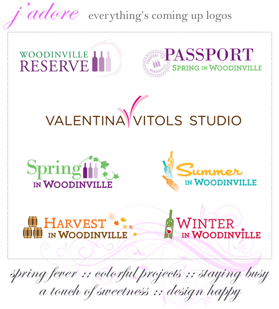
What's also dandy is follow-through with regular updates on this marvelous concept of a simplified portfolio website. I finally gathered together some favorite projects throughout last year and added them as new work on my website. AMAZING -- someone give me a gold star for beating the Procrastination Monster! My design style tends to be fairly clean and uncluttered, especially for brand designs. Logos are meant to be distilled, clear communications of a business or service, and the design should reflect that without a lot of fuss. And it should function well -- be easy to work with, size up or down with no hassle, and depending on the subject matter, nothing too fidgety or overdone. I enjoyed working on photographer Valentina Vitols' studio logo. Photographer logos are wonderful to work on -- so clean and simple, since often times the logo becomes the watermark on their photographs, so you don't want it distracting from the image. The work is literally refreshing! I also have fun with illustration embellishments when the situation calls for it. Being able to work on a full seasonal family of logo designs for Woodinville Wine Country's different yearly events was particularly fun and colorful. Consumer/retail-facing design is a lot of fun to work with -- it's literally like a trip to Disneyland, which I know sounds strange, describing a day of work like that. But I really do enjoy my work and updating the portfolio is less about LOOK AT MEEEEEE! and more about being incredibly grateful for the chance to work on such fun projects.
So pardon this Bird's blatant feather-preening, but here's to the things that we're lucky to be a part of, the things that put a literal spring in our step!
Jaunty Fine Print: Logo designs by Denise Sakaki


No comments:
Post a Comment
Merci buttercups! Your comments are appreciated! (hit the 'post comment' button twice, sometimes it's buggy)